As
I promised in the last game update, I am going to be posting my drawings
whenever I can. I decided to scan these drawings and explain what they are and
how it is going to be implemented in the game. These are just some drawings
because the other drawings are being used by Denmen7 to program. The three
images that I am showing to you guys right now are these:
This
picture is the main menu, the place you start off in when you open the game. As
you may see, I have already added the image for the buttons. The exit button is
meant to be a wing, kind of like a metaphor, since I was trying to compare
people leaving the game with people flying away from a place to go to somewhere
else. I have also put a question mark as the “about us” button as well as the
wrench as options. In the left of the bottom bar, the arrow has two buttons,
the feathers are the credits and the rest is for help. As you may see, I wrote
the title “The Lost Tales”
temporarily just so I get an idea to where the title should be. So far I don’t
have the buttons to play the game because I want the programmer to copy and paste
the knife below the title first, which I am going to explain later when it is
done.
Next
on is the default look in game. This is what you are going to see when you are
going to be playing for the first time. We are planning to make options for the
player to change how it looks. In the top left hand corner I drew a minimap in
a shape of a compass. Denmen7 loved this idea so I hope you guys do too. Next to
it are the HP and MP bars as well as the level. These bars tell the player how
much health points or mana points they have and the current level of the player.
Below it are empty bars which I am planning to put buttons on for people to
access their inventory. To the left, there is a pop-up which is a monster
description. I am planning to make it so the monster the player has selected
appears in this window and it describes what level it has, how much health and
mana and some information about it. Last but not least, the bottom bar is
currently empty but it’s going to be the spill bar and Inventory hotbar. This
is where the players put their skills and items for easy access instead of
always going to the inventory or skills page.
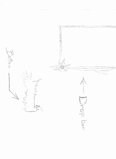
The
last image I got is not so exciting but the first image is the drop bar. This
is for when the player click a button below the HP and MP bars, the bars will
drop down, giving the players even more buttons to choose from. And the last image
is the buttons for the pause menu, when the players hit the pause key.
These
are, once again, just a preview of the images I have done and more are coming
soon so hold on because time rushes by as quickly as the rushing wind. Sadly, I
got some horribly sad announcements to make which might make you guys either
sad or impatient… Or you might not even feel anything about it. dRagon has
decided to turn this game into indef. What is indef you say? Well, indef is the
abbreviation for indefinite, meaning, we are not sure if we are going to
publish it or publish it anytime soon. Since we have just begun, we decided to
back up a little and start another game and make it much simpler. This means
that, this game might not even be published until maybe even after four years
(sad face L).
For those who are sad, I am happy you are sad because it means a lot for us that
you guys care about it but hold on, we are making another game, but not as
complex as this one. Information for the next game is going to be displayed in
the next post. That’s all for today, kind of longer than expected, my name is
StevenSYM and until next time.
-StevenYQM


No comments:
Post a Comment